Video: Viewing the Public Cloud Overview Report
Video: Viewing the Public Cloud Overview Report
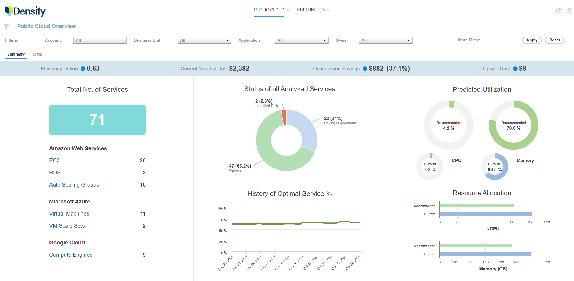
Figure: Public Cloud Overview - Summary Tab
Figure: Public Cloud Overview - Summary Tab
Services Included in the Public Cloud Overview Report
The Public Cloud Overview report aggregates your cloud services that have been analyzed by Densify. Cloud instances that do not have adequate information for analysis, such as guests with incomplete or missing benchmark data, are not included in this report. Optimization opportunities for specific cloud platforms are options on the Public Cloud menu. See Optimizing Your Public Cloud for details. Also see Viewing Cloud Optimization Reports - RDS. You can display specific cloud services using the following grouping and filtering options:- Recommendation Filter Menu—See Using the Recommendation Filter Menu;
- Guest filter—See Using the Guest Filter and for details on configuring and using these filters.
Summary Banner
Key metrics are displayed in a banner at the top of the report. If you have applied filters, the totals, displayed in this summary, reflect the filtered results.Figure: Summary Banner
Figure: Summary Banner
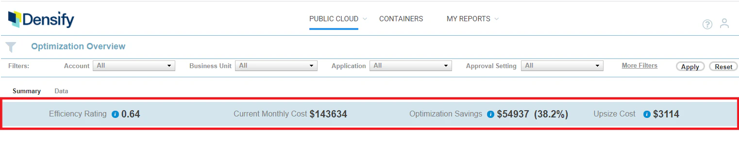
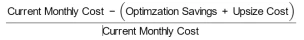
Table: Summary Banner Descriptions
Table: Summary Banner Descriptions

Spot instances are not included in this table or in the Summary tab. Refer to Viewing Cloud Optimization Reports - RDS for details,
Total Number of Services
This table shows the total number of instances within the analyzed environments. Inventory is then broken down by cloud platform and the type of provider service.
|
|
-
The first one shows you the number of instances that have not been analyzed due to a lack of collected data. This value is not affected by Guest Filter or Recommendation Filter settings.
Contact Support@Densify.com for details on resolving issues related to these systems. - The second, indicates that all the costs shown in the report are estimated costs only, based on per instance costs and predicted uptime.
Status of all Analyzed Services
The recommendations for your cloud services in your environment are summarized in the pie chart. This chart shows the breakdown of instance recommendations by Optimization Type as shown below.Table: Summary Banner
Table: Summary Banner
History of Optimal Service %
The line chart shows the number of instances that are sized correctly over time. For each date, optimal service percentage is calculated as the ratio of (the number of systems that are sized correctly) divided by (the total number of systems, defined by the set of filters on that day). The axis scales based on the amount of data up to the maximum of 6 months. If you hover over any data point in the graph a popup indicates the percentage of systems that are “Just Right” on the selected date. As you apply the recommendations, the number of right-sized instances should increase over time.Systems with ‘No Data’ are not included in these counts.